Tuesday, May 23

Talking about information.....

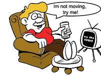
Recently i attended a presentation given by a professional on his business module. I would be lying if id say i heard the whole thing and it was amazing. The truth is i heard it all well alright but only about every few minutes i ran back and forth in my head as to what i was gonna do later in the day, what movie should i get and oh shud i get a double cheese burger or just some soup of the day. Then i heard the fellow talk some more and oh i wondered whats the soup of the day..i hope its tortilla soup...

Well this only happened because the guy spoke about the same thing in 100 different ways and threw numbers and matter at me every few seconds. The presentation went on continuous for an hour. Boy was i happy when that got over. Now i was stuck there as it was real and people were in front of me and if i left half way then it would be unacceptable and rude.

But the beauty of a website is that a user can leave as and when he likes and you cant do a damn thing about it. You wish you could but well you cant. So here's the point again people design easy with easy information and keep it little and useful, dont go on and on. It's not music!
How much is too much? Why reach a point that says stop the madness!

Ok so far i've been talking about how designers need to start thinking, and how they need to apply usability at every step of the design process. But lets take a moment here and talk about information that constitutes a huge part of the experience the design will then ascent and accent.
Think of an article/advertisement/site that provides so much information on something that no amount of graphic or visual aid is going to release the stress the user feels while reading it. Not getting it ok lets simplify this.....

An advertisement for say a baby pamper. On the layout theres a picture not too large just about the right size and then theres information with it. Now the information consists of the name of the product, the dimensions, the quality, the price, the color, the make, the comfort, details about the company that made it, why you should buy this and not anything else, where you can find this, contact customer service, website URL, etc..
Ok so what size was the graphic.....ummmmm!! yes this is what happens in reality, even on the web. When you provide this much information all at the same time the stress you cause to the user is such a throw off that the chances of him continuing on your site or even making a sale is hard.
Now lets take the same example and provide an experience out of it at every step.
1- medium sized graphic
2- three liner description of the product, benefits, dimensions, etc..etc. all of this using the correct verbiage, simple to understand.
3- price and order option

once this has happened you move the user on to the next level where he will need contact information, other store options, discounts etc etc....
The point im trying to make is that give the user only what he needs to know at that point. Here's a little trick i apply!
Tell your self if i had only 10 seconds to say hello and ask him/her out how would i make the most of those 10 seconds and get a positive answer. It always works!!

Monday, May 22

Design...did anyone ever stop and think its true meaning? Shall we.....

If you actually look up the word design in a dictionary or on the web most will quite break it down to its simplest form, which in many ways is what you need to apply while designing for the web.
I found some nice ones that have helped me approach the simplistic side of design.
-the act of working out a form of something
-create or execute in an artistic or highly skilled manner
-conceive or fashion in the mind
-invention:the creation of something in the mind (my personal fav)

I like to define design as a moment of expression that lasts for about a few seconds, minutes if your'e lucky; when nothing stands between you and the board.
But i also do believe as a designer that not everything i design has come out of a moment. What im trying to say is that not everything i design is good. Only 5% of everything i design is good so what do i do with the 95%? Well i make sure that 5% is well distributed on the page so as to compliment the remaining mediocre or nearly satisfactory 95%. This is where most good design formulae come from. Try it out! pick out a piece of art, web page, anything that you consider to be a design. See how many parts of it you love and how much you find satisfactory. The above will become more obvious to you than ever before when you find the answer!

Thursday, May 18


Im not getting up....and thats that!

Just like that, there i said it. This is how most people feel atleast 5 times a day. Well think about it. Your'e sitting on the couch watching tv the buzzer on something goes off..what do you do.
Now if only everything in the world was at arms reach the world would be perfect. So im thinking there are somethings that i am willing to get up for but most im not. I want the remote on my right, cell phone on the left, laptop near the remote so i can switch between the two easily, tea that never gets over......the list never ends. Oh Oh.. i also want another person in arms reach so that if i cant reach something i can tell them to get it for me. Yes we all think it, come on now.
So as a designer how do you address this on a website. A little mental check list that i always do is:
-make a list of all the features you want to showcase/offer
-sort these features out in order of relevance
-make sure you dont go over board with the content causing too much noise on the page
-maintain the element of surprise subtly to entice the user to surf deep into your site.
While designing you have to tell yourself how can i make your'e life easier today and not how can i make me happy by confusing the hell out of you.
Remember convenience + easy to use goes a long way!

If everything is equally important, then nothing is very important

You hear a lot about details, from "Don't sweat the details” to "God is in the details." Both are true, but with a very important explanation: hierarchy. You must decide what is important, and then attend to it first and foremost. Everything is important, yes. But not everything is equally important.
If you manage to categorize into the above then you know its gonna work.

Tuesday, May 16


Size matters......It always does!

Well atleast on a webpage it does. Think about it, as a designer you always want to see things clear. While designing dont get carried away with what looks good and avoid the critical factor of visibility. Keep in mind the following before you decide to carry out any kind of analysis or redesign. It always helps.
-font size must be hierarchal to the vision and in terms of importance of the content.
-size of the visual elements/graphics must be proportionate to the content. You dont wanna have an over bearing graphic stealing attention from the content. It could work negatively for you and throw the user off.

The Warehouse Syndrome...


Users come to your site expecting things to work the same way they are already used to. As a designer your'e always looking to design something new, something "creative". Well users dont get creative if your definition of creative is something they dont see all the time. I call this the warehouse syndrome. When warehouses with options, browsing space, useful information is what users are used to the "creative" which in opposition to the warehouse would be small stores with unconventional appeal and content, doesnt have much room to take.
Use standard web conventions as breaking them or changing them may throw users off. So far there isnt anything that says this is a standard and if you dont follow it you die. But there are elements in design that make life easier for the user and the designer. These then tend to form the so called conventions. Standard elements comprise of tabs, hyperlinks being blue and underlined, navigation bars being on the left or right verticals....*
Regardless the purpose of the site, these standard elements on a web page placed correctly reduce half the work for the user. He comes, He knows where to look, He has answers, He stays and well maybe if you have managed to captivate him He even buys. At the end of it we all want a sale now dont we!

*Look out for upcoming posts on GUI standards.

A world full of choices....

Do you ever get that feeling that it's just too exhausting to go shop for shoes! Well that's because there are just too many choices. By the time i reach "i want this" im too tired to be bothered to go on and figure it out. Why does this happen?
Well as a user if i am given a whole lot of choices which are too similar to each other but have a small element of difference then im gonna get all muddled up.
For online shopping, choices are good so long as they are not creating confusion and exhaustion for the user.
First of all if the user is shopping online:

-S/he probably doesnt have the time or patience to go to a store and browse and get confused.
-S/he prefers doing their homeowork online so that store shopping is one stop shop for them.
-S/he has the patience of a 5 year old to actually sit and figure out what you're trying to offer.

I like to categorize users into 3 areas. The Zero, the Hero and pretty much everthing else in between
*.
No matter what category the user may fall into they come onto a website with a set of questions that already exists in their head before they typed the URL or searched your site out. You dont want to give them a web page that brings up so many choices that makes them think so hard that they will end up forgetting why they came there in the first place.
-Mindless choices is what they are looking for.
-No confusion browsing is what they look forward to.
As a designer it's imperative to provide the above for an experience the user will enjoy.

*Zero-new to the internet, Hero-power users, everything else in between- well need i say more.


"The world's mine oyster.
Which I with sword will open."

Now that's what users are thinking before entering a store. Well I'd hate to burst your bubble but if your site aint able to provide a user with his oyster then the chances that you'll ever see him again are rare.
How do you know what's whose oyster? Even if you did manage to get that then how do you know its gonna work. Lets take it one step at a time shall we.
-picture yourself entering a store that gives you the most satisfying experience.
-what all about the store did you remember or manage to retain from your past visits.
-what changes would you make to the store so that it would give you optimal satisfaction.

No your'e not done! Now erase this from your head and think like you would think if the store was yours and random people would enter it daily and each one had a different need and a different way of seeing the store and a thousand bubbles over each ones head.
Now the world's not your oyster but theirs and your finally being able to see that. Design to address the user's needs and not yours. How are you going to give the user convenience and not strain is what you need to be thinking.


Why Experience Design?

Have you ever been to an art gallery or visited a website and left feeling like "What a Whacko", and then you tell yourself did i just waste good time?
Well the reason is quite obvious. You came. You saw. You left.....BLANK.
You experienced it alright, not just the way you thought you would or simply had an unpleasant experience. you did not Experience the Design as the design did not meet your expectations.
This is where i step in to give you some insights on how every thing your eye sees or every interface your eye interacts with needs to be an experience that you were able to retain with consent from your brain.
Yes we retain bad experiences too (duhh) but thats only so we dont go there again. That is something that i call negative retention and not very useful if your'e someone trying to sell something to someone now is it??